BUSCA >

CONCURSO PROJETO CAU|BR 2025
CRIAÇÃO DE NOME LOGOTIPO MARCA
Proposta apresentada pela arquiteta e designer Nasha Gil, ao Concurso para nova Identidade Visual do CAU/BR, FPRES e CEAU/CAU/BR, não classificada.
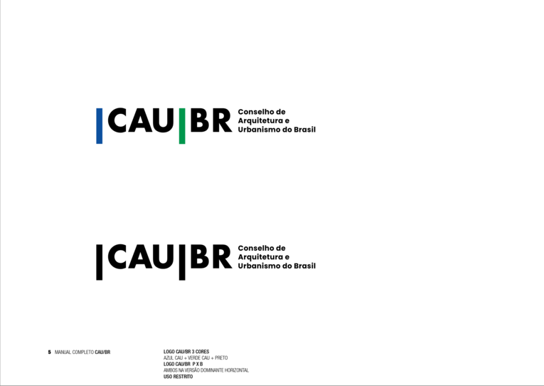
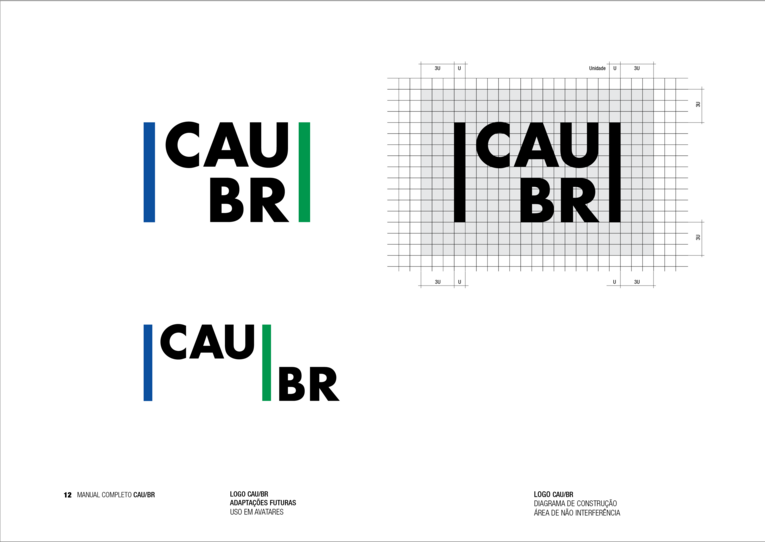
A proposta para a nova identidade visual do CAU fundamenta-se em elementos estruturais da arquitetura, onde foram traduzidas a solidez e o dinamismo da profissão através de barras verticais que, além de sua função estética, simbolizam os pilares fundamentais que sustentam tanto a arquitetura quanto o urbanismo brasileiro.
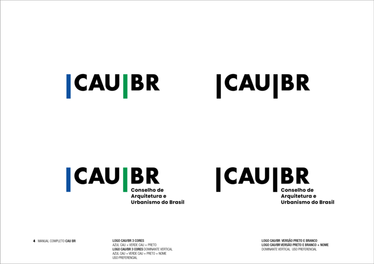
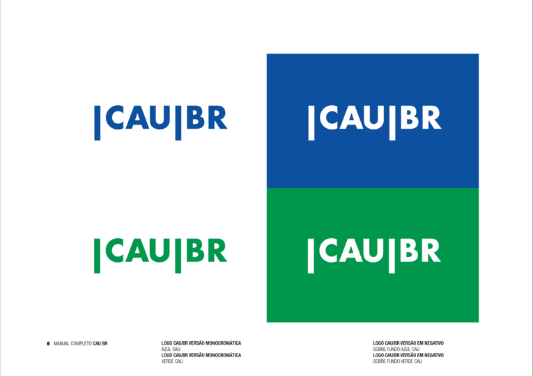
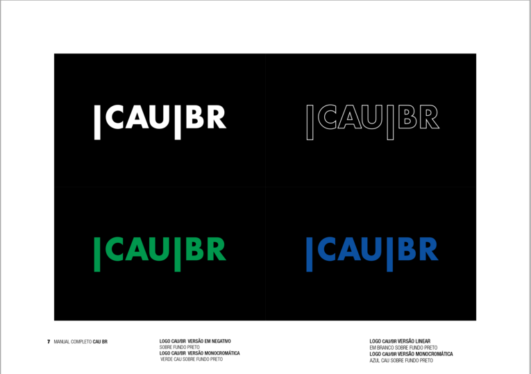
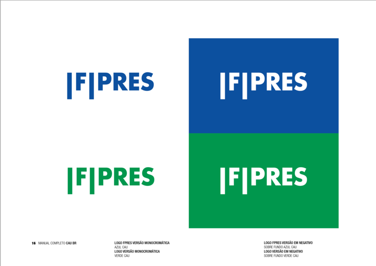
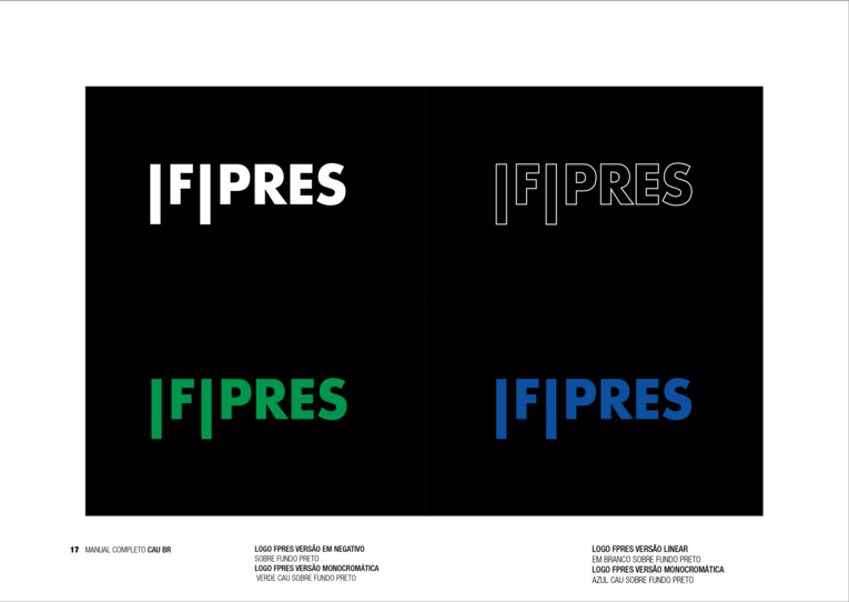
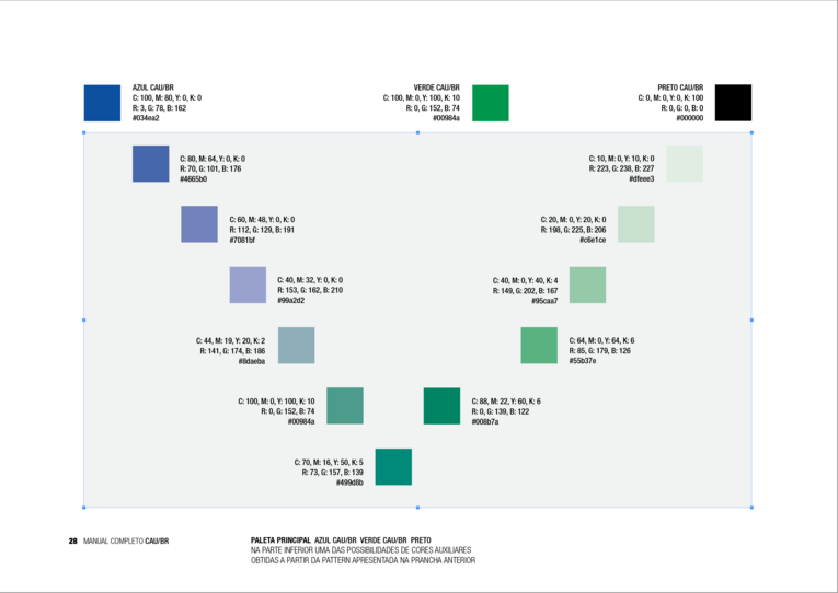
Na construção do sistema visual, optou-se por uma paleta cromática que combina azul e verde, cores que carregam significados estratégicos: o azul representa a solidez técnica e a credibilidade institucional, enquanto o verde simboliza o compromisso com a sustentabilidade e o desenvolvimento urbano responsável. Esta escolha cromática dialoga diretamente com a missão do CAU de “promover arquitetura e urbanismo para todos”.
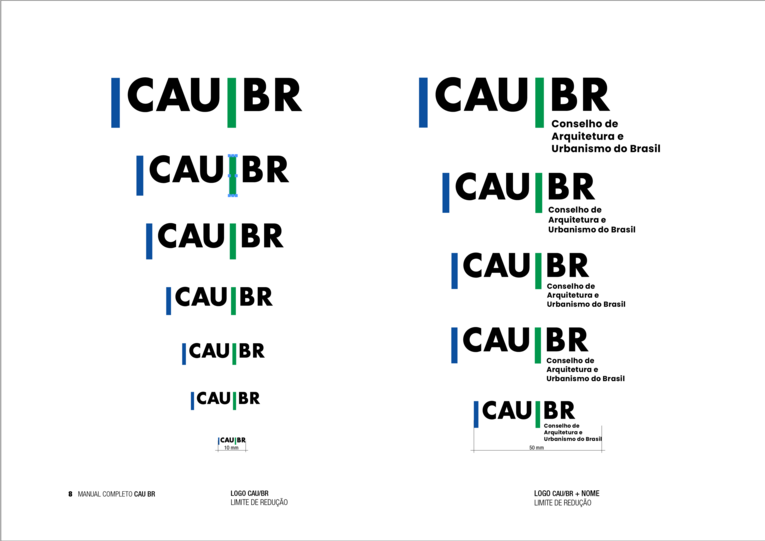
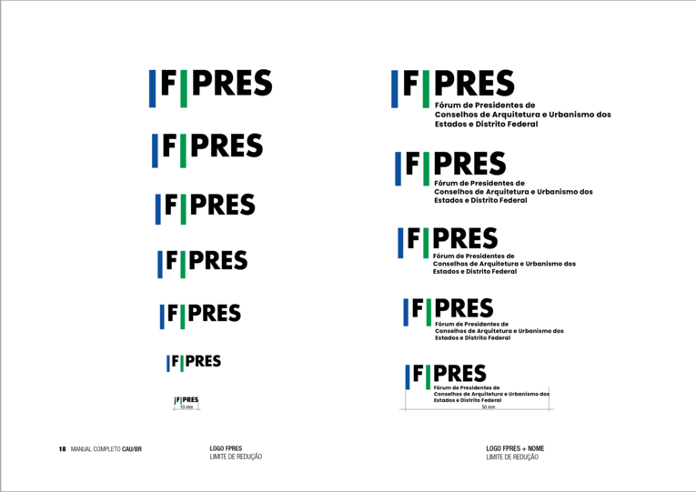
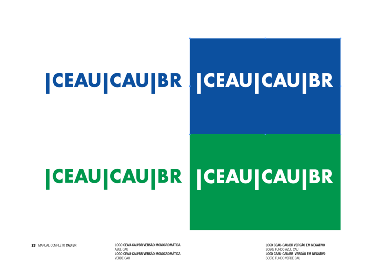
Tipografia em preto, robusta e sem serifa, garantindo excelente legibilidade em diferentes escalas e suportes. O sistema tipográfico estabelece uma hierarquia clara entre as siglas e seus descritivos, permitindo identificação imediata e leitura fluida em qualquer aplicação.
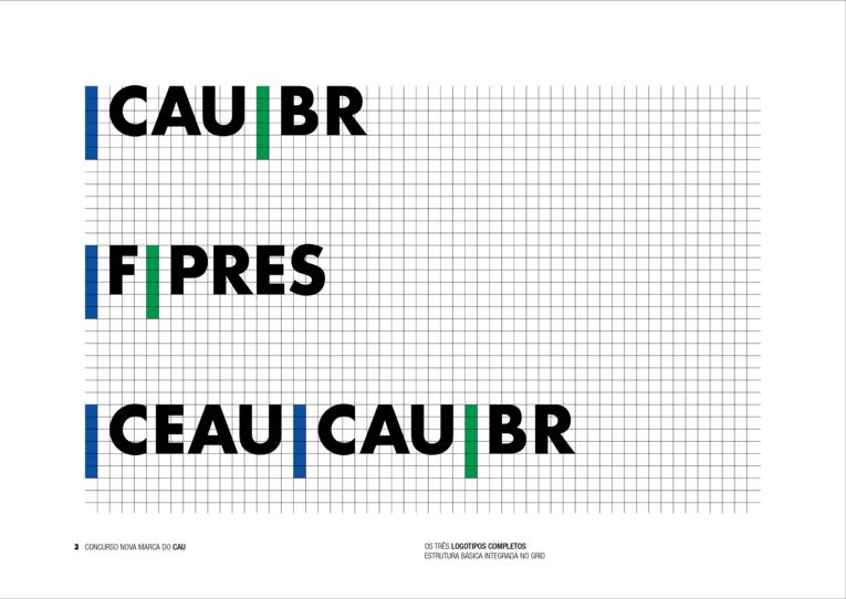
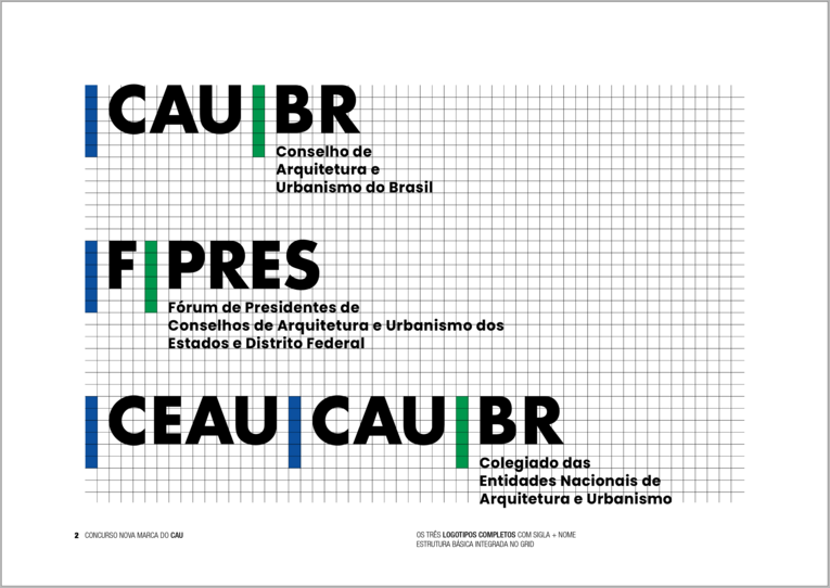
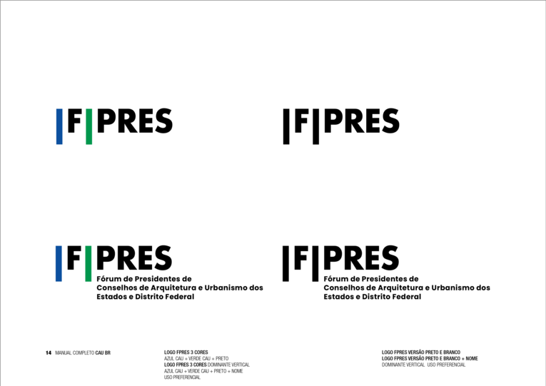
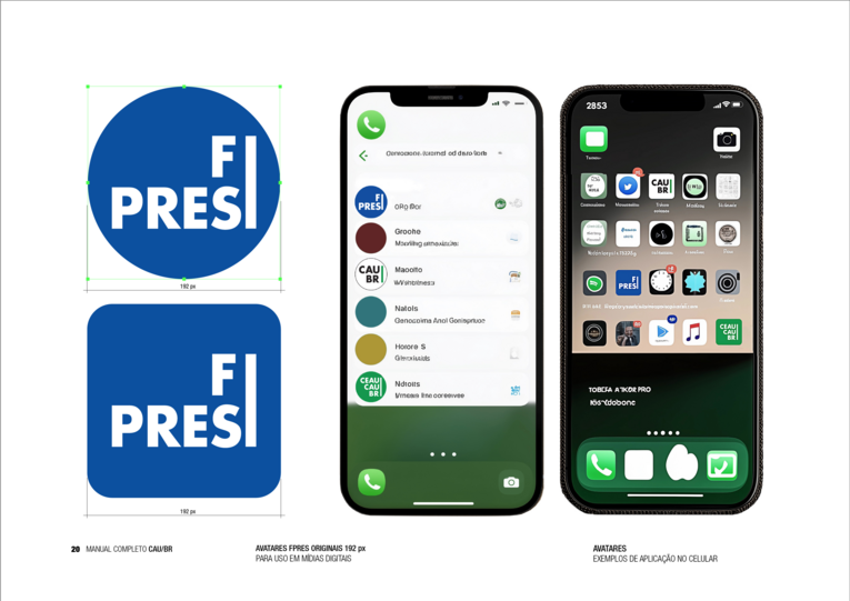
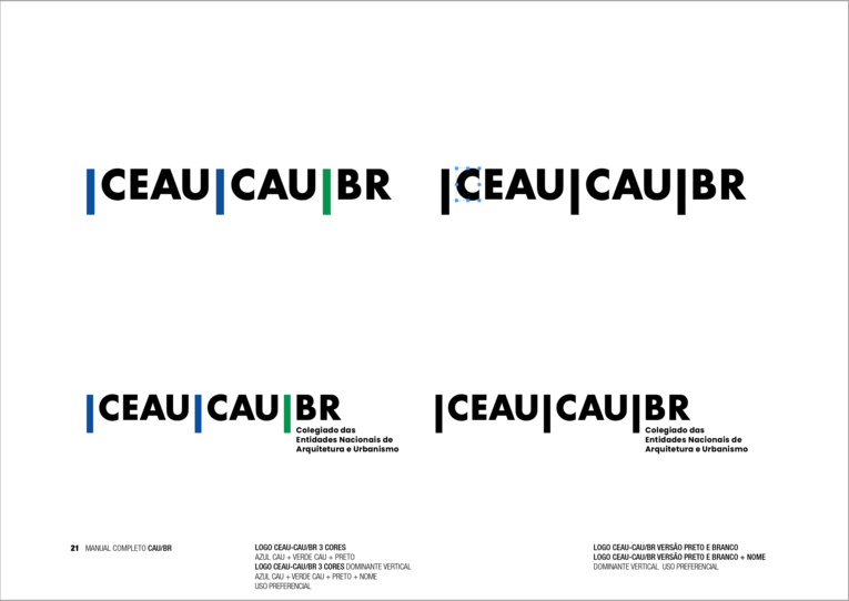
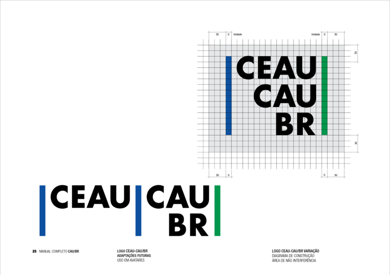
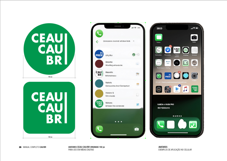
O conjunto criado permite que cada entidade mantenha sua identidade própria enquanto evidencia sua conexão com o sistema maior. As barras verticais funcionam como elementos unificadores, criando um código visual instantaneamente reconhecível que conecta as três instituições: CAU/BR, FPres e CEAU|CAU|BR.
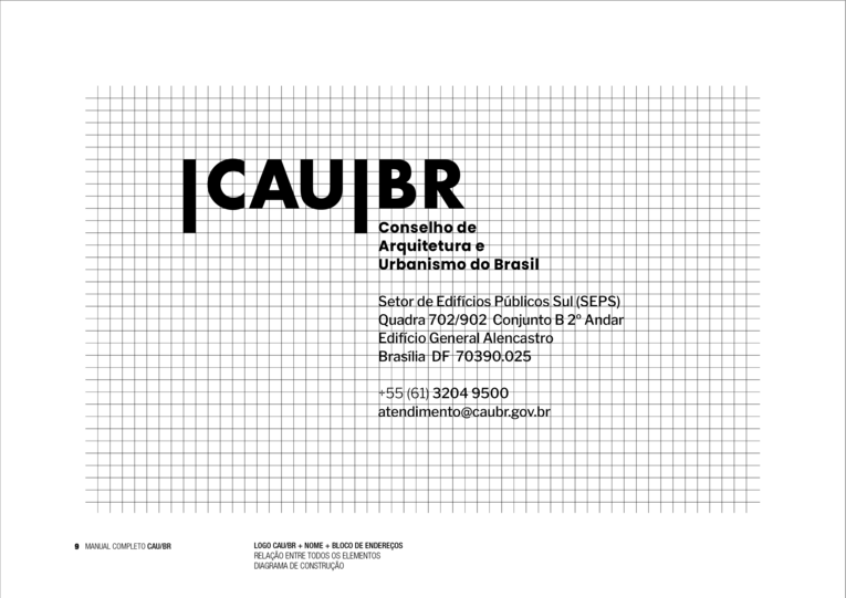
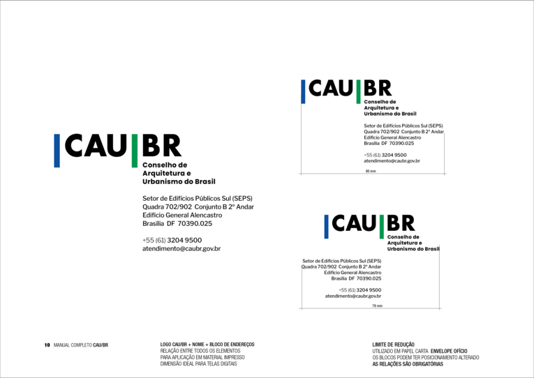
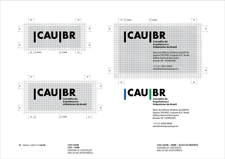
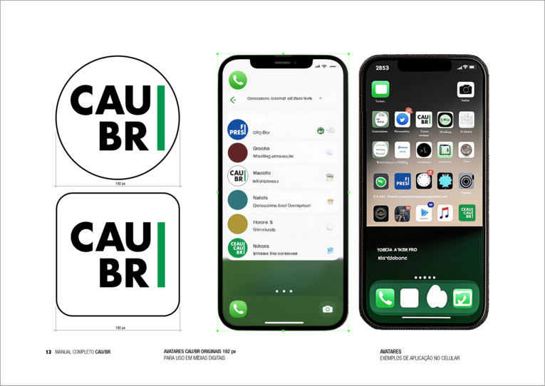
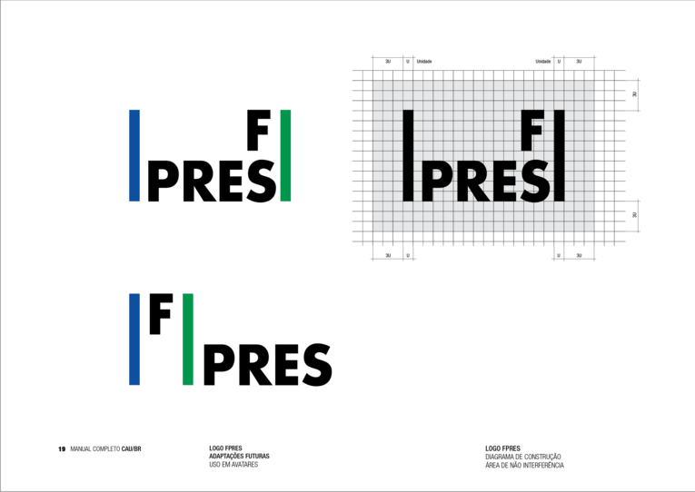
Na marca CAU/BR, as barras emolduram a sigla com precisão, estabelecendo o padrão visual que se reflete nas demais marcas.
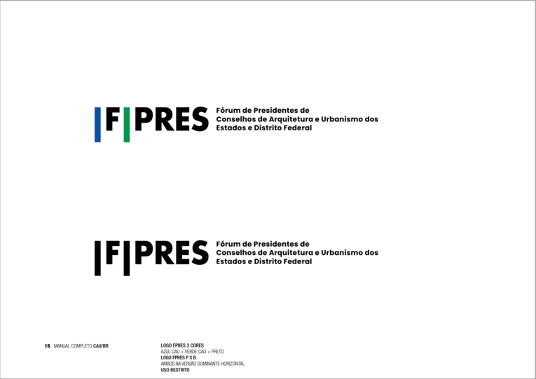
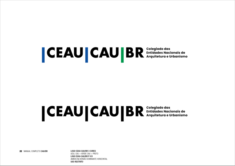
O FPres adapta esse conceito mantendo a mesma estrutura, enquanto o CEAU|CAU|BR expande o conceito horizontalmente, refletindo sua natureza de colegiado através de uma composição mais ampla.
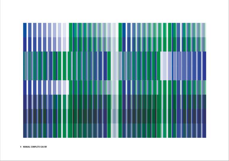
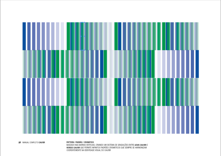
Desenvolvi também um pattern baseado nas barras verticais, criando um sistema de gradações entre azuis e verdes que permite infinitas possibilidades de aplicação, mantendo sempre a coerência visual do conjunto.
O resultado é um sistema de identidade visual contemporâneo e durável, que honra a tradição da arquitetura e do urbanismo brasileiro enquanto se projeta para o futuro, representando com dignidade as instituições e sua missão perante a sociedade.
Infelizmente, o projeto não obteve, nem mesmo, menção honrosa no resultado do concurso, o que, mais uma vez, prova a situação de ignorância visual em que se encontra nossa profissão, em nosso país. Por isso, mostramos o projeto aqui no site.
A cobra jibóia está solta e as cascavéis aplaudem!