SEARCH >
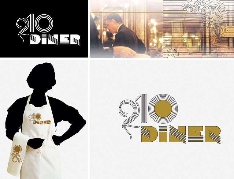
DINNER210 LOGO
DINNER 210 OCT2009
IDENTITY FOR AN AMERICAN DINNER
The office does not lend itself to develop
thematic identities, friendship that existed
with the owners, proposed to develop the
identity inspired by the famous American Dinners,
which in fact, were former wagons train
readjusted to restaurants.
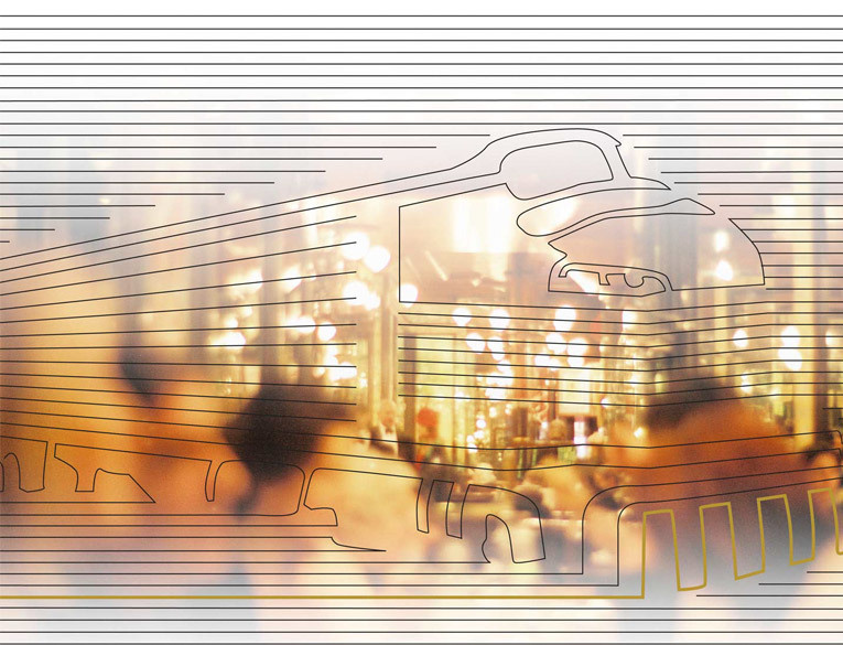
Approach
The studies were performed aiming at the use of neon in
frontal and seek a printer capable of being reproduced by this
type of lighting and at the same time would be able to refer to
the time of the success of dinners.
Solution
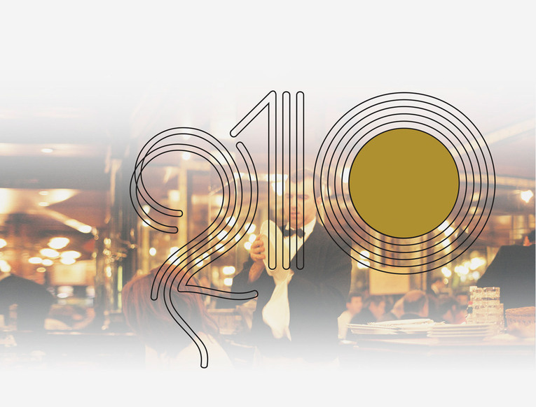
Typography used was the Sinaloa. We present various boards
for the customer containing examples for the application of
the brand. The customer has accepted the mark and not used
our services for complementation and implantation of the same.
Today, as already noted the applications of the mark really
working against the same, the branding proposed by our office,
was not respected, which can be visualized and monitored by
boards presented here.
Creative Director and Design
Vicente Gil
Project Assistant
Caio Yuzo Higashino